

Eulogy for the Art School.
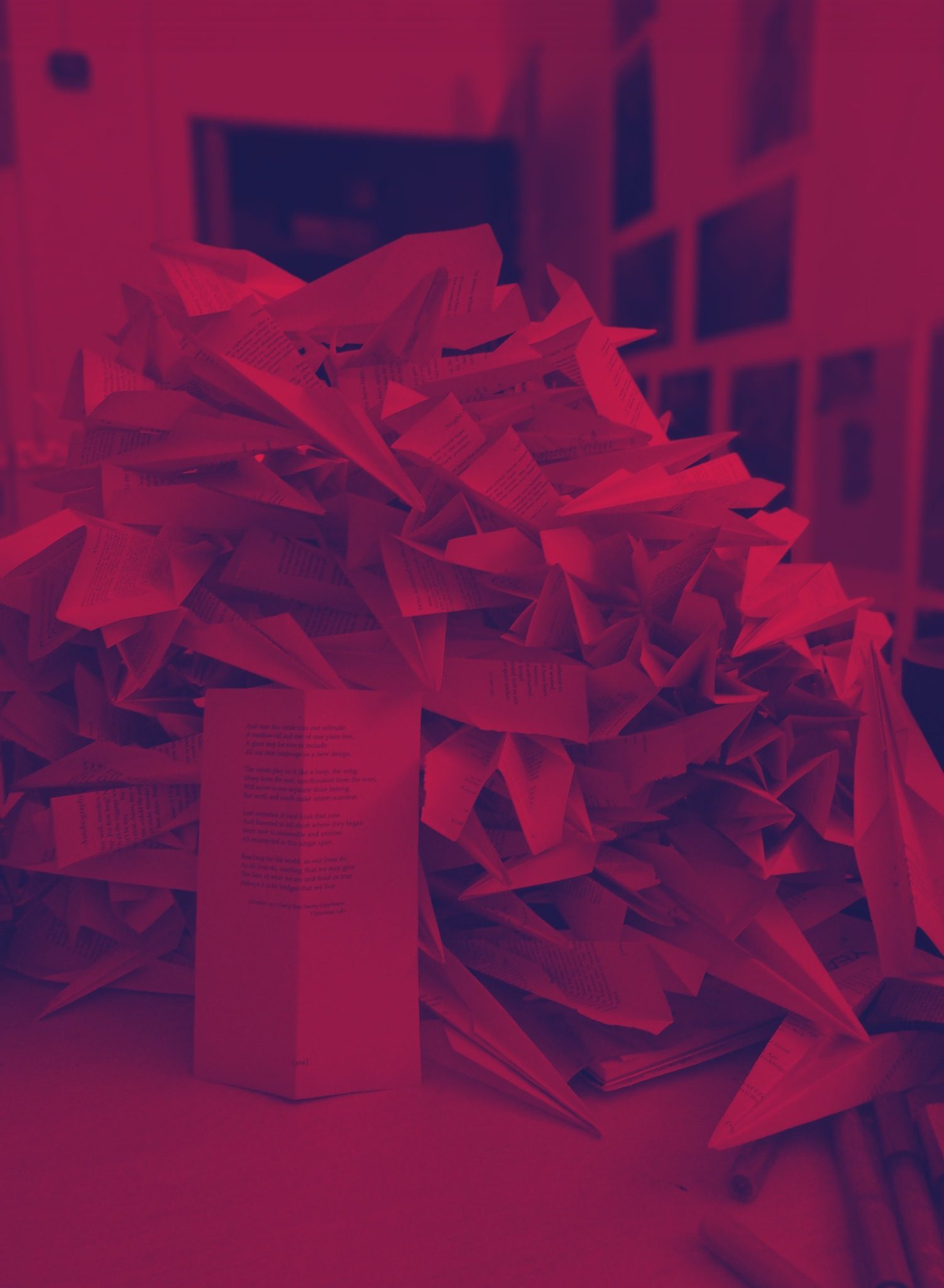
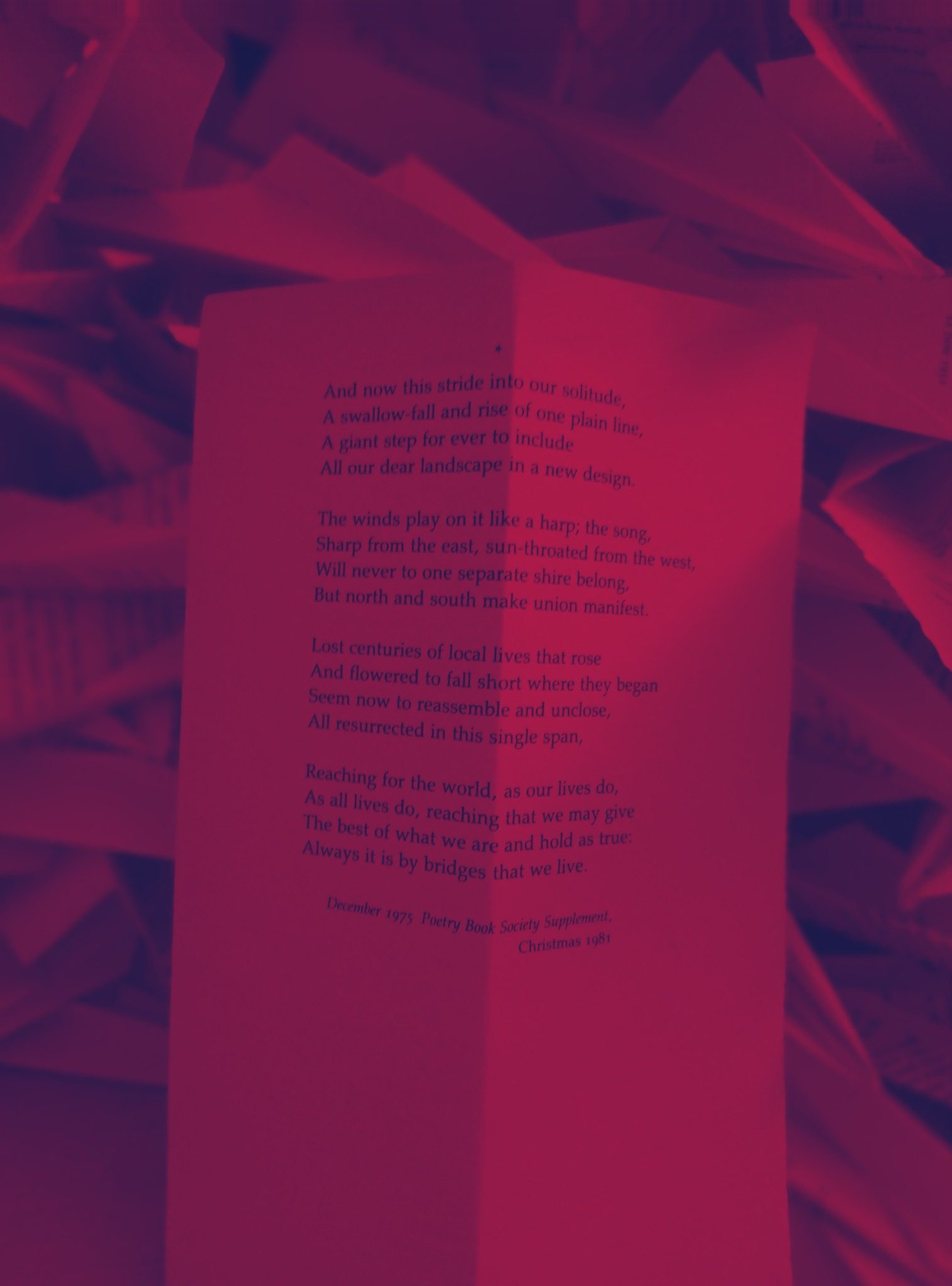
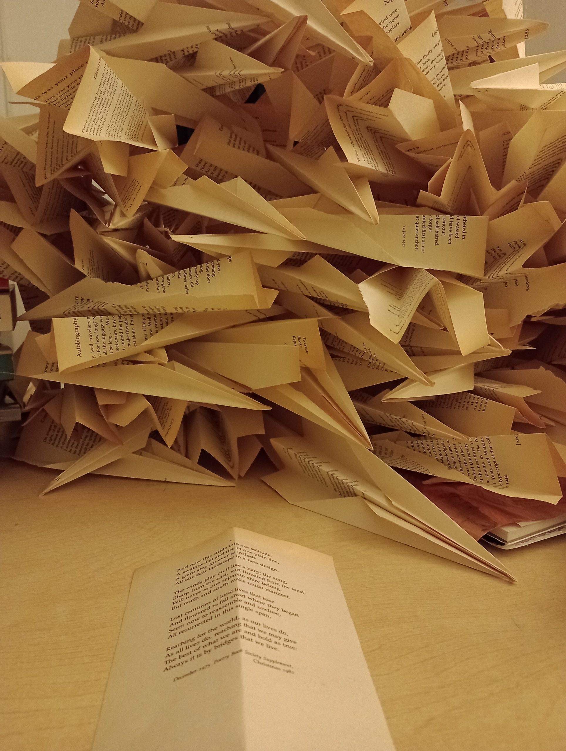
‘The building, it howls’ that thought ping ponged around my head until I tossed it out into a bit of paper, the words that fell out then found their way on to the studio wall in invisible ink. The Philip Larkin poems was from a book that I picked up at the seasonal pop up bookshop in the Mander Centre (@popupbookshopwolves on Instagram)… decided I had to take a photo of the last paper plane before I folded it fully!
The colours used for the font came from the Wolverhampton colour palette, with the final two parts being black on white (death), white on black (ghostly)… I found a lil bit of colour palette history here: https://thecolourpalettecompany.com/collections/the-wolverhampton-colour-palette they said:
Six colours. One proud city – Wolverhampton
The Wolverhampton Colour Palette celebrates a city built on industry, music, football and community. From the roar of Molineux to the legacy of manufacturing and the sound of glam rock, Wolverhampton is a place with a strong identity, and even stronger pride.
Known for its industrial roots, working heritage and Wolves’ Old Gold, this is a city that wears its colours proudly. Whether it’s matchday, music, memories of local landmarks or stories passed down through generations, these six shades capture Wolverhampton in a way locals instantly recognise.
The colours of Wolverhampton
Bonks’s Bitter – pays tribute to the beers of Brewery Road (say it as a local would!).
Slade Flame – honours the glam-rock legends.
Old Gold – is for the Molineux faithful.
Cosford Sky – is for glorious aircraft at a special place.
Chimney Blue – celebrates the much-missed Goodyear chimney.
Trolleybus Green – for Wolverhampton’s local transport of old.
Home to great beer, rich industrial history and a passionate population, Wolverhampton is a city of colour (mostly gold!) and culture.
…ya learn somethin new everyday! 🙂